All headsets can be divided into two main families: Serif and Sans-Serif. The first is distinguished by serifs — short strokes at the ends of the letters. Headsets from the Sans-Serif family do not have serifs. It is believed that strokes facilitate the perception of the text, making the letters more legible and directing the gaze along the lines.
Historically, the Serif family has been widely used in printed materials. And Sans-Serif has gained popularity on the web. Therefore, serif fonts are associated with classics, and without strokes — with something modern. Keep this in mind when choosing fonts for your presentation.
If, for example, you talk about the rich heritage of the company and its history, probably the best choice would be in favor of Serif. But if we are talking about an innovative product or initiative, then it is probably worth choosing Sans-Serif.
Try not to use more than 2–3 headsets in one presentations. The font type creates visual coherence and combines parts of the content into one whole when other images and other elements differ. If there are more headsets, you risk violating the integrity of the presentation.
Decide which fonts you will use to create the headings, subheadings and body of the presentation. Observe your choices on each slide. Good advice: use the same font for these three elements, but with different degrees of fatness.
The length of a text string plays an important role in the formation of a complete and structured markup.
Short lines are easier to read than long ones. When the eyes do not need to make too long transitions, we perceive the text better. That's why magazines and newspapers traditionally use the column format. This speeds up and simplifies reading.
The acceptable length of the string is on average 45-90 characters, including spaces. Such a number offers a guide to the design of the text Butterick's Practical Typography, written by American typographer Matthew Butterick (Matthew Butterick).
A versatile set that is perfect for any — at least formal — presentations.
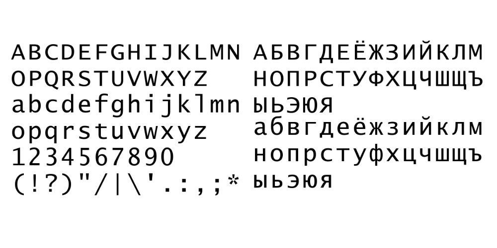
This monospaced font is highly readable and looks great in titles and headings.
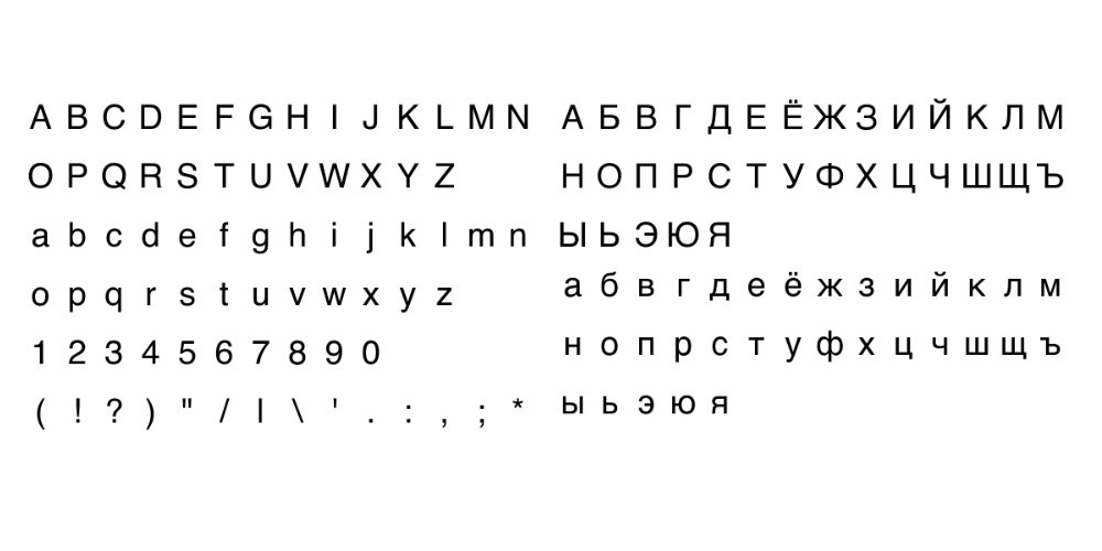
The beauty of Helvetica is that it retains its clarity even with a small size. That's why this font is great for the text in the body of the presentation.
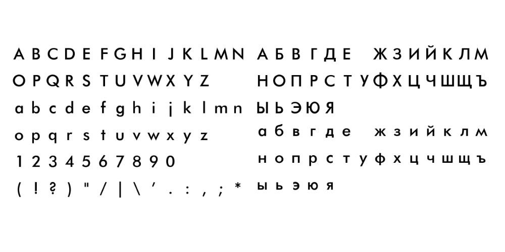
The personality that this neat font embodies is enough to enliven your presentation. It will add brightness without distracting from the essence.
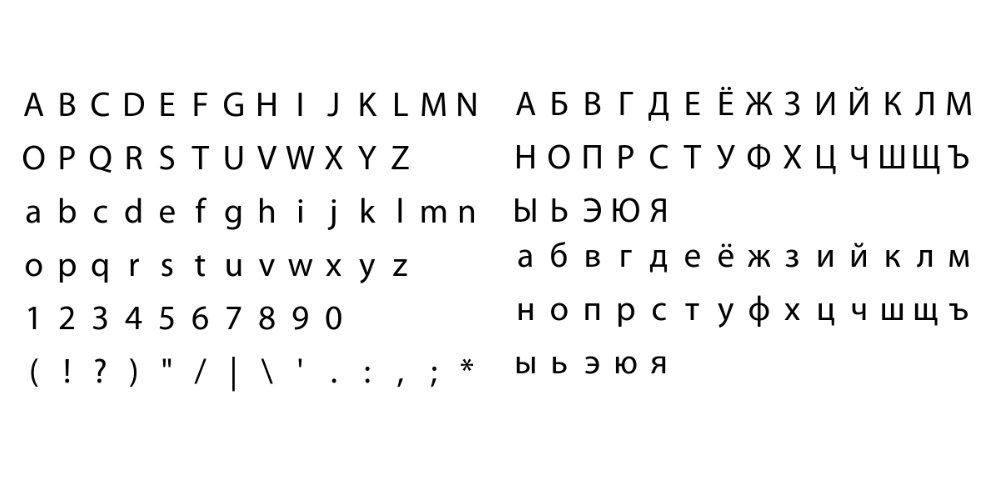
Myriad Pro is known for being used by Apple for years. If it is good enough for such a company, then this font will certainly work for your presentation. Myriad Pro looks elegant, but at the same time restrained.
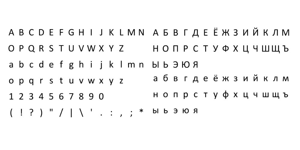
A very common font, although others in this list can hardly be called unpopular. Calibri will not surprise anyone, but in a professional setting, this is not necessary.
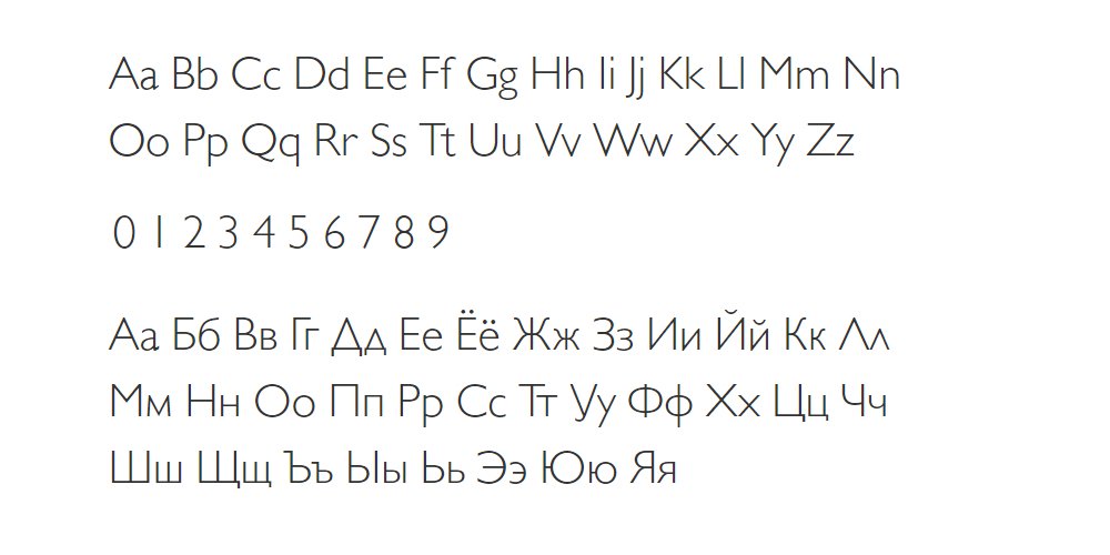
Despite the fact that this font was created in 1928, it does not look old-fashioned. But it has a touch of classics that distinguishes Gill Sans among the new fonts. It is suitable for both the presentation body and titles and headings.