Reddit users have shared strange images with strange and ambiguous logos that they have encountered. The selection includes both really funny options and rather creepy ones that scare off potential customers.
1. Let's start with a simple one — it's just the logo of a handball club.
2. And it's easy to distinguish fake Nike Air Jordan sneakers by such a logo.
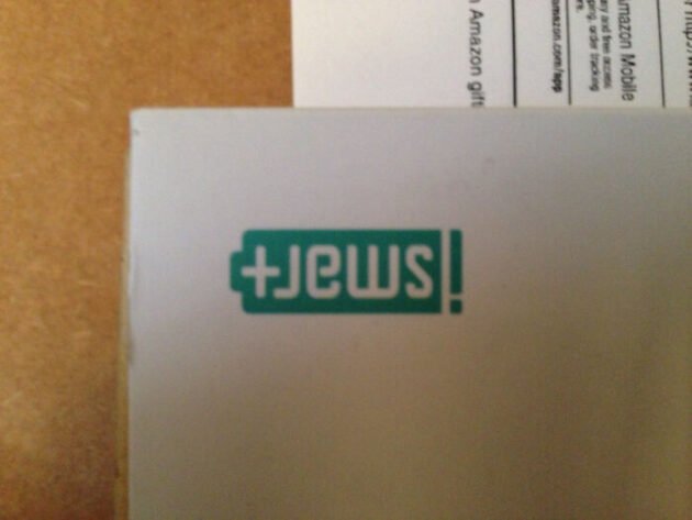
3. The inverted iSmart logo reads like Jews.
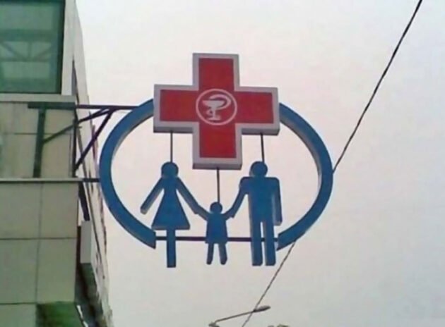
4. It is better not to turn over this logo of the children's hospital.
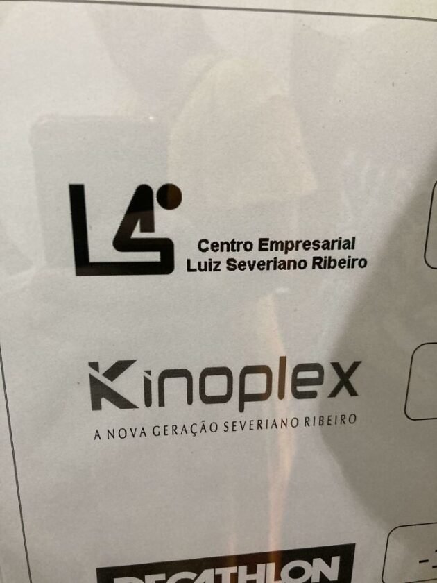
5. Logo of the business center. It would also be suitable to designate a toilet.
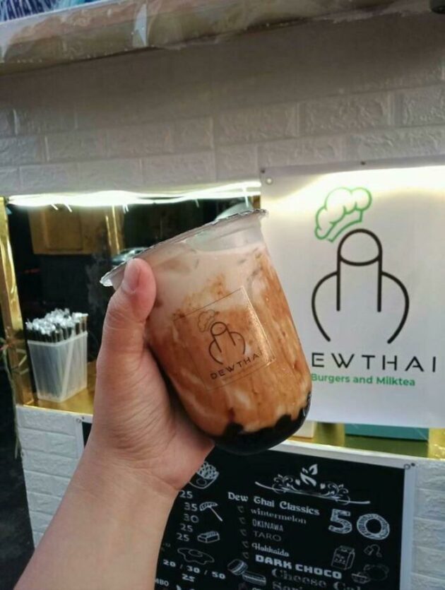
6. Logo of a Filipino cafe with burgers and milkshakes. It depicts a large straw inserted into a cup, the owner of the establishment explained.
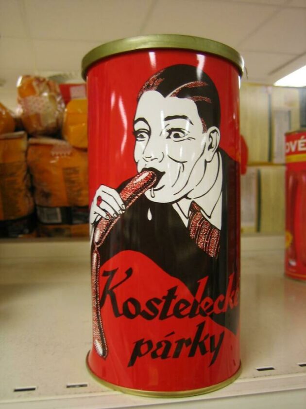
7. The logo is an image of a Czech sausage company.
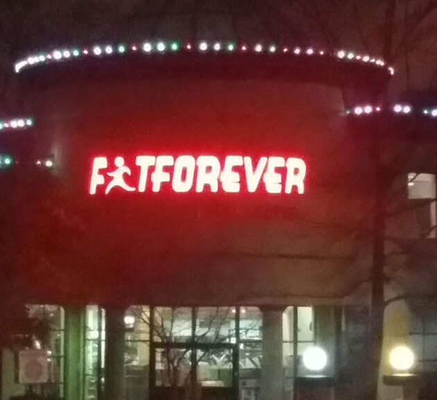
8. Not the best branding for a fitness center. It was probably supposed to be read as FitForever, but it turned out to be FatForever (fat forever).
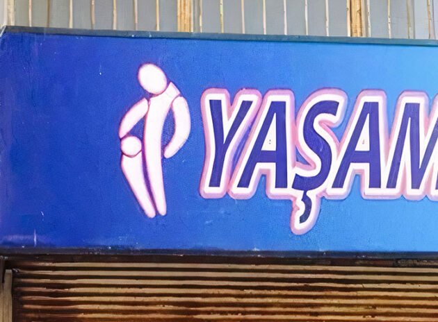
9. The logo of the Turkish brand of water.
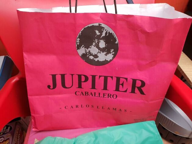
10. Jupiter store with the Moon on the logo. Why not.
11. An unfortunate logo for a doctor's office. It does not motivate you to visit at all.
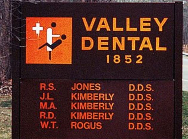
12. And this is just the logo of a dental clinic.
13. Creepy logo for plastic surgery.

14. There are absolutely no comments here.
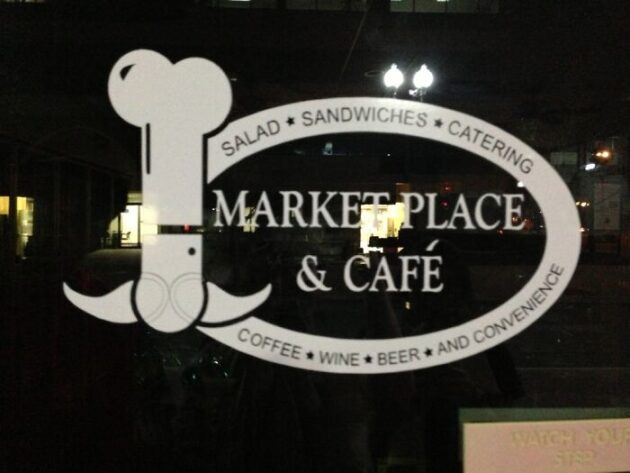
15. And then someone seemed to make fun of him by making such a logo for a cafe.
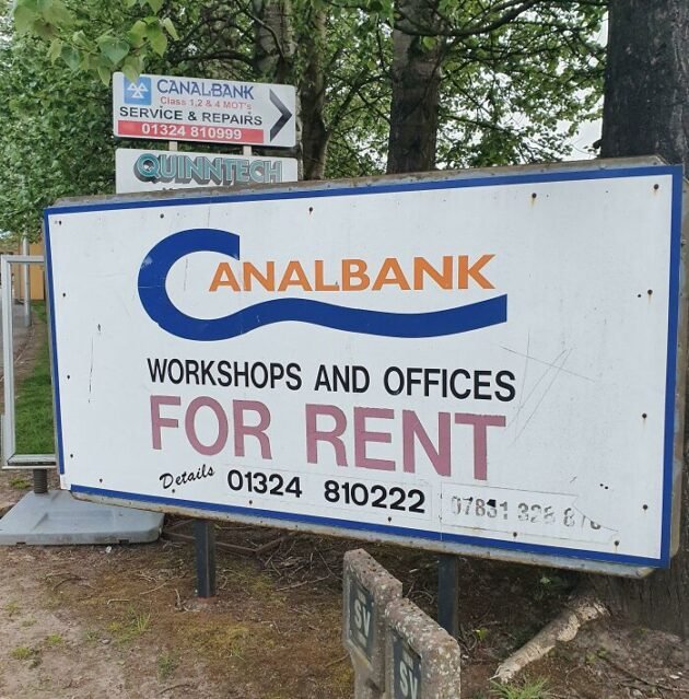
16. And finally CanalBank.
Have you met strange and ambiguous logos? Share it in the comments.